Problem statement
Social Care Alba faced a fragmented digital presence with a tonal mismatch, lack of consistent information, and difficulty managing multiple communication channels and file locations. Each audience (staff, families, clients, and potential hires) struggled to find relevant information. The goal was to create a cohesive system that would unify tone, improve access, ensure compliance, and be easy to maintain.
Solution implemented
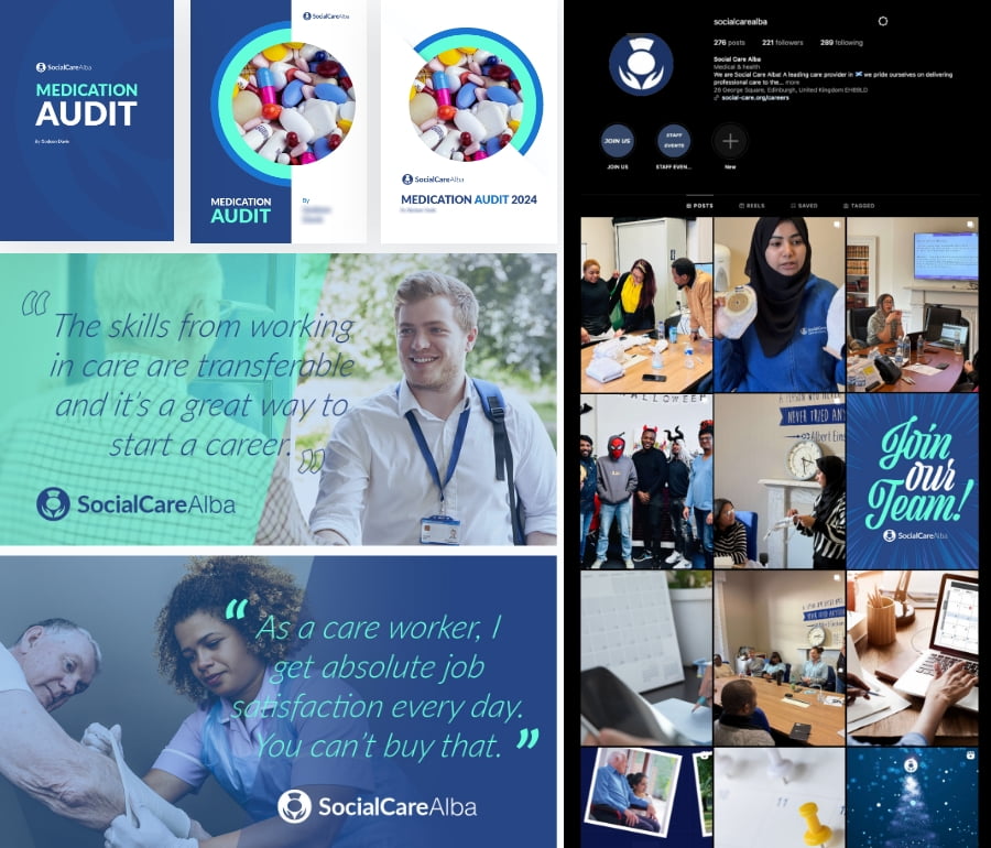
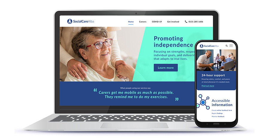
We consolidated processes and developed a modular design system, brand refresh, and detailed content guidelines for internal and external audiences. A key focus was defining a clear and consistent tone of voice that aligned with the organisation’s values, ensuring all communication felt compassionate, professional, and accessible. Playbooks were created for responding to sensitive topics (such as complaints or negative reviews), emphasising transparency and honesty.
Additionally, to enhance accessibility, we introduced audio summaries and podcast-style updates, allowing users with varying literacy levels or preferences to access key content in an alternative format. This ensured that all information, including important policies and updates, was accessible to a wider audience, including those with visual impairments or those who prefer auditory content.
The new structure accounted for:
- Recruitment flows: From interest to induction, including integration with recruitment software and email sequences.
- Internal access: Policies, staff documentation, and service user resources via secure internal pages.
- Public clarity: Insights into care philosophy and operations, accessible to prospective clients and families.
Audience research
We engaged a diverse range of participants through interviews, surveys, and prototype testing—including frontline staff, many of whom are non-native English speakers or come from varied cultural backgrounds. This helped shape accessible content structures and plain-language communication. HR administrators shared insights into applicant tracking and onboarding pain points. Families and service users—including those with disabilities and differing levels of digital access—contributed through regular feedback sessions, team leader meetings, and a dedicated research panel. This inclusive research approach ensured the final design met the real-world needs of all user groups.
We also evaluated all available analytics data and ran card sorting exercises to define a content architecture that mirrored user expectations, improving findability and reducing support queries.
Recruited multiple participants for regular interviews, surveys and prototype/live testing sessions.
Liaised closely with HR administrator, surveys and feedback from applications in process.
Regular meetings with care staff team leaders, service user advocate, research panel and collated feedback and testimonials from families.
“I never know where to find the latest policy.” — Team Leader
“I just want an easy way to find out what events are coming up and who to contact if there are any issues” — Family member of a service user
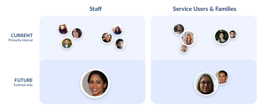
Identified requirements for four key audience cohorts:
- Current staff: Internal access to policies, schedules, and documentation. Streamlined creation of documents that meet regulatory and security requirements.
- Current clients (Service Users and families): Clear communication around care philosophy, upcoming events, training, complaints handling, and day-to-day support.
- Potential hires: Honest insight into the team and values, supported by a frictionless recruitment and onboarding flow. Further segmentation possible in recruitment process and targeted e-mails and text messages.
- Potential clients: In-depth presentation of care quality and approach, with clear calls to action and routes to contact.
Proposed structure and technology
The website was designed to serve as the central hub for all digital communication and access, streamlining the user experience for both internal and external stakeholders. Its structure was adapted to provide:
- Two secure internal areas: Confidential access for staff and service users & families, addressing frequently asked questions, pointing to policies, required training and upcoming workshops.
- Recruitment flows: Separation and expansion of Careers section and seamless handoff from site to applicant tracking software and induction with follow-up emails sent via SendGrid.
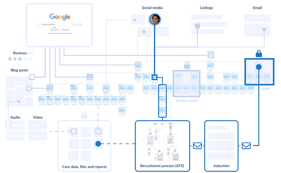
Sample user journey for a potential external applicant: Starting from a social media post, leading to relevant website details, potential further research (including reviews), progressing through the applicant tracking system (ATS) and induction, and finally accessing the internal staff section, relevant files, and software.
We defined clear content principles rooted in a shift-left philosophy: embedding accessibility, inclusive language, and security from the start. This included guidelines for digital-first document structures, responsible AI use, online conduct, and robust data and privacy practices.
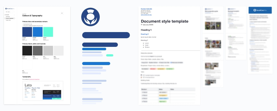
- Design system: Scalable, flexible visual components, documented via Zeroheight for clarity and consistency.
- Content framework: Emphasis on clear, accessible, inverted pyramid writing, modular layouts and formats for internal and external audiences, and standardised templates.
- Accessibility: All content and templates were developed to meet WCAG 2.1 AA standards, incorporating high-contrast colours, keyboard accessibility, semantic HTML, and screen reader compatibility.
- Google Suite integration: GDPR-compliant workflows with templated documents, clear role assignments, version tracking, and secure access across all materials.
Iterating on content and SEO strategy
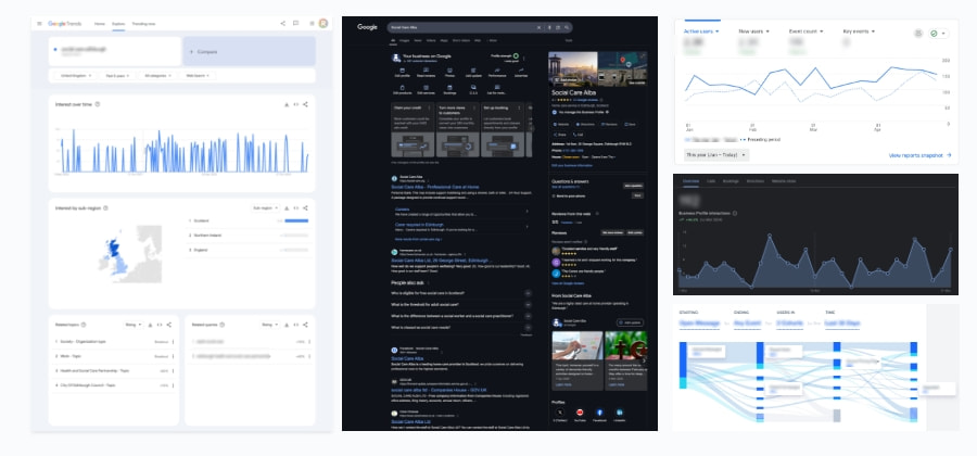
- Content audit and adaptation: Mapping and improving existing site structure
- Search query analysis: Used to refine navigation flows and define reusable building blocks
- SEO improvements: Enhanced Google profile, regular blog, social media and Google posts, and SEO measures
- Continuous evaluation and responding to surveys, reviews, feedback forms and support tickets
Soft Launch
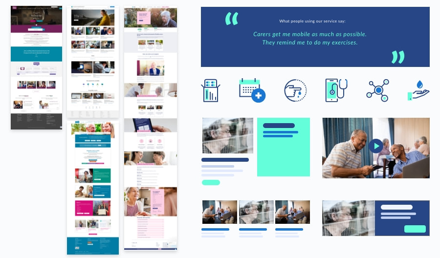
Initial launch included the updated brand visuals, improved content structure based on building blocks observed in competitor research, SEO setup, and review of internal access systems. It served as the foundation for broader rollout. Early feedback was positive, particularly around document accessibility, vindicating a full transition to Google Suite.
Key results
- Unified tone and improved trust across audiences (anecdotal and through feedback collection)
- More efficient internal communication and document access, removal of editing steps in process
- Increased engagement with recruitment pages and blog content, leading to more appointments and significantly faster onboarding
- Improved review scores, higher Google ranking and search visibility
- Improvement of inspection Scores with real-time dashboard access rather than compiling reports
Key takeaways
- A modular, principled content system scales better than piecemeal fixes
- Tone and accessibility matter as much as structure
- Integrating compliance from the start simplifies ongoing management
Ongoing communication and compliance
- Creation of templates for staff to set up reports autonomously (drag and drop)
- Newsletter and update strategy: Internal and external updates through scheduled emails
- Social media management: Scheduled posts, focused on people, with image usage approved in advance
